Questions from the youth
Last week I participated in a small group discussion with a group of mostly students during the Dayton Creative Syndicate portfolio review. Some of their questions were very interesting so I decided to comment on them.
- What is more important, education or experience? I would say your work is going to be more important than experience and education. It shows that you have experience and can apply design principles, whether they were taught, learned through books, watching others, or come naturally.
- How do you cope with working in-house when you are the only designer and they don't know what good design is? Approach in-house as you would with working with freelance clients. Typically you are going to be the only person working on a project so you need to be able to edit yourself, proof yourself, and look at your work through a different mindset. It might be foreign at first but being able to develop those skills will end up reducing design time and increase profits. Sometimes good design is a hard sell. If the employer can see how the design will produce results (and money), they are going to be more likely to go with your idea.
- What kind of salary range should an entry-level designer expect? In my area, it was about $9-12 an hour for entry level designer. That said, if you can bring to the table more than just print you have the ability to make more. Web design and front-end coding skills are highly desirable.
- Should you negotiate your salary or take what they will give? Always see if there is wiggle room and realize salary isn't everything. If they can't budge on salary, consider the flexibility of schedules, extra perks, reduced insurance costs, etc.
- What kind of work does an entry-level designer do? Typically they finish up what a senior designer has done. Some tasks might seem menial but they help develop your eye for design ad detail. Sometimes you will generate new pieces based off existing layouts, using the clients branding guidelines. There will also be some pre-press work involved such as packaging files and getting a CD made for a printer.
- What makes a good interview? Be confident of yourself and your skills and don't be afraid to ask questions. Research the company before you even get to an interview so you know you are going to be comfortable with the type of work they do and the direction they are going.
- What should you say in an interview if they ask, "Why should I hire you"? For me it's that you can do the work, do it well, and do it on time.
- I have a hard time getting an interview, what am I doing wrong? You might not have enough diversity of projects in your portfolio. If you are a print designer and have only ads, it doesn't show that you can do logos, brochures, annual reports, etc. Having web, as I said before, will also help. You want to show that you are well rounded. If you are sending out email inquiries, make sure they actually received them. Request a follow-up (or call them). You never know if you get put in someone's spam folder accidentally.
- If there is a job opening that asks for a Bachelor's an you only have a 2-year degree should you go after it? Never be afraid of opportunity. Sometimes they put a higher requirement just to weed out the people who wouldn't meet other requirements. If you have a strong portfolio and excellent experience and references, put yourself out there. You don't have anything to lose.
- How do you get more clients? Word of mouth is your best way to get a client. It shows confidence in your skills and performance and builds bigger networks and client relationships. In addition, you should have a solid web presence to showcase yourself and drive search engine traffic your way. Be nice to your clients. I've actually gotten a call from someone who needed a new designer because their other one (actually a firm) treated them poorly.
- How can I expand my portfolio? Take a look at what is missing. Make sure it covers all your skill sets and displays various types of print and/or web.
- What makes a good portfolio? Diversity in pieces and uniqueness. I want to see something that hasn't been done before. It shows creativity and good thinking skills.
- How do you handle your own freelance in addition to a full-time job? Balance typically comes in the form of time management. When you are doing freelance after work, you need to set yourself a schedule of when you are going to commit to things and when you aren't on that schedule, unless you get a rush request, don't be tempted to work on your freelance. Creativity doesn't need to come from sitting in front of a computer. Let your mind relax and design while you are doing other things. If you have a family, they should come first.
- What are your sources of inspiration? Everything is an inspiration, but architecture and music are the two big ones. I like many different styles and architecture being a design form in itself translates similarly to graphic design. Modern is minimal.
- What motivates you? My family and when I see a really awesome piece of work thinking "why didn't I think of that?"
Adventures in Proofing: What's wrong with this picture?

Really, make sure you've got your photos paid for and switched out! As I said in my tweet to them: "Too cheap to buy stock photos or use them legally lessens me wanting to subscribe."
Whether they did actually buy it or not doesn't matter - they have made the assumption public. In addition...the "forward to a friend" button goes nowhere.
That white space above the button was me - deleting the contact person's name. I didn't want her to get hate mail.
Hermes Awards 2011
I know this much - I won something!
I got the notice on Monday that the Alfa Electronics logo I designed scored me a win of some sort. Considering that the "competition" is advertising firms and I'm just me with no creative team besides the little elves in my mind, that's saying something.
I'll find out more on February 26th when they have the awards ceremony.
 |
| Winning Entry |
A few more case studies
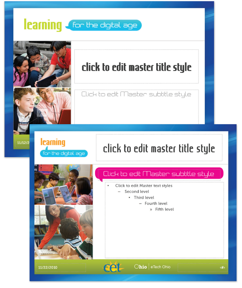
Learning for the Digital Age
While working at Public Media Connect (CET/ThinkTV PBS stations) as Art Director, I was solely in charge of developing a complete identity for a new education initiative funded by eTech Ohio (state). My role (each station was given a role for the project) was to develop the look and feel, style guide, and the collateral materials.The entire project timeline was less than one month.
The logo was developed in different colors (green and orange) as well as a black and white version both horizontal and stacked.
I developed a brand guideline for use by the stations and also for any vendors they might use for the project.
Covered subject included:
- Project overview
- Branding overview
- Logo usage and color
- Imagery guidelines
- Font guidelines
- Sample templates

A series of flyer and postcard templates was produced so the stations could update for their own workshop information and schedules.


Miami Valley Child Development Centers Website Redesign
I was sub-contracted to redesign this site and give it a fresh and modern look while keeping it still youthful. I enlisted Edge Webware to do the coding implementation since it required a very robust CMS build to accommodate all the client's needs.The old website was very outdated and in much need of a new look.
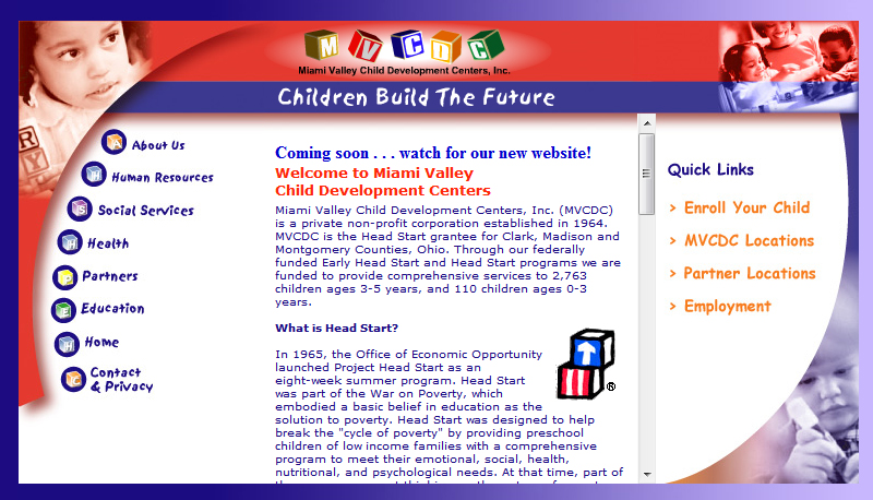
I began to process what I wanted the site to look like based on the expansive request of content that needed to be on the page. I created a wireframe that I passed onto the person I was contracted by.

The video area was quite large (but it was requested to be that large). After further convincing load-speed would be an issue, the layout was adjusted and further developed with engaging graphics.


This is the final layout concept for the homepage. I did interior pages with the same feel and kept the colors more muted.

* please note, the logo above is not the client's logo and it is not used in the final live site. I suggested this adjustment to the logo for better legibility but it was rejected. I am including it as part of my portfolio because I believe it best represents myself as a designer toward this piece.
View the live website: http://www.mvcdc.org
Subscribe to:
Posts (Atom)


