A few more case studies
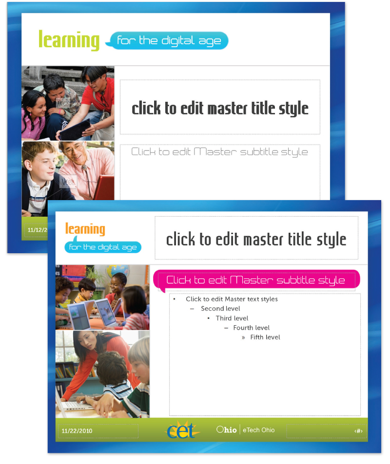
Learning for the Digital Age
While working at Public Media Connect (CET/ThinkTV PBS stations) as Art Director, I was solely in charge of developing a complete identity for a new education initiative funded by eTech Ohio (state). My role (each station was given a role for the project) was to develop the look and feel, style guide, and the collateral materials.The entire project timeline was less than one month.
The logo was developed in different colors (green and orange) as well as a black and white version both horizontal and stacked.
I developed a brand guideline for use by the stations and also for any vendors they might use for the project.
Covered subject included:
- Project overview
- Branding overview
- Logo usage and color
- Imagery guidelines
- Font guidelines
- Sample templates

A series of flyer and postcard templates was produced so the stations could update for their own workshop information and schedules.


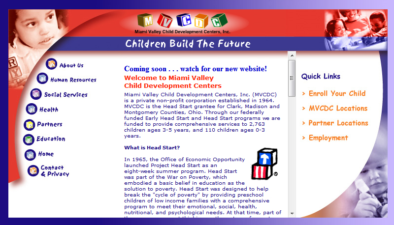
Miami Valley Child Development Centers Website Redesign
I was sub-contracted to redesign this site and give it a fresh and modern look while keeping it still youthful. I enlisted Edge Webware to do the coding implementation since it required a very robust CMS build to accommodate all the client's needs.The old website was very outdated and in much need of a new look.
I began to process what I wanted the site to look like based on the expansive request of content that needed to be on the page. I created a wireframe that I passed onto the person I was contracted by.

The video area was quite large (but it was requested to be that large). After further convincing load-speed would be an issue, the layout was adjusted and further developed with engaging graphics.


This is the final layout concept for the homepage. I did interior pages with the same feel and kept the colors more muted.

* please note, the logo above is not the client's logo and it is not used in the final live site. I suggested this adjustment to the logo for better legibility but it was rejected. I am including it as part of my portfolio because I believe it best represents myself as a designer toward this piece.
View the live website: http://www.mvcdc.org
Subscribe to:
Post Comments (Atom)


0 comments:
Post a Comment